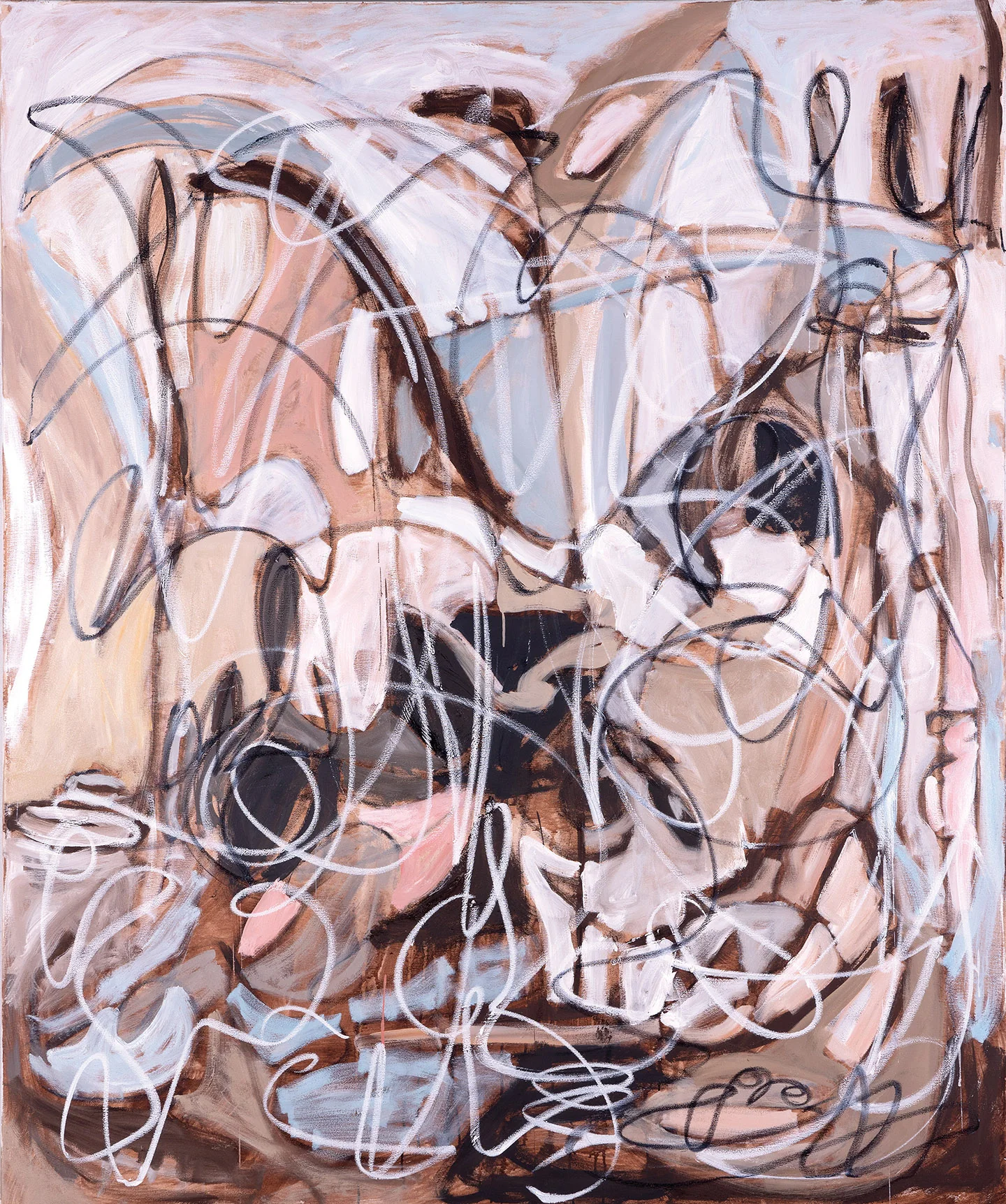
An autumn palette need not begin with orange leaves and brown earth. The season also contains pale skies, artificial light at dusk, wet pavement, fading greens, and the startling brightness of a color glimpsed through a window. Painting can respond to these relationships without describing a recognizable landscape.
The interest lies in proportion as much as hue. A small warm accent can change an extensive cool field. A gray passage may make an adjacent violet feel more saturated. When color is understood relationally, the palette becomes a structure of pressures and releases rather than a list of seasonal associations.
Try describing a painting without naming its colors first. Does it feel concentrated, dispersed, brittle, dense, or suspended? Then identify the relationships producing that impression. This reversal makes room for a more personal understanding of color, one grounded in what the work does rather than what a season is expected to look like.