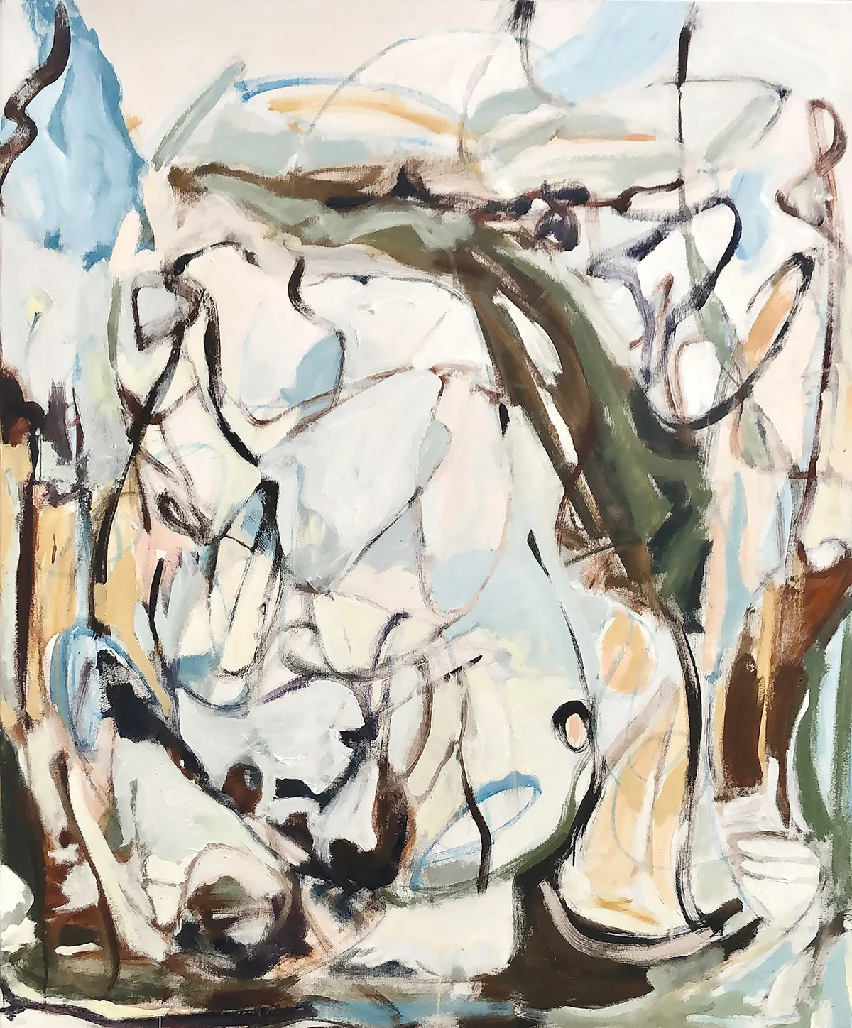
Put two works beside one another and comparison begins before the visitor has read either label. A pale painting may look cooler next to a golden one. A tiny drawing may command more attention because it gives the eye a place to rest after a large, densely worked surface.
Look back and forth several times and notice what transfers across the space between them. A gesture in one can make a similar direction visible in the other, even when the works use different materials. The spacing matters because it determines whether the comparison feels immediate or takes a deliberate turn of the head.