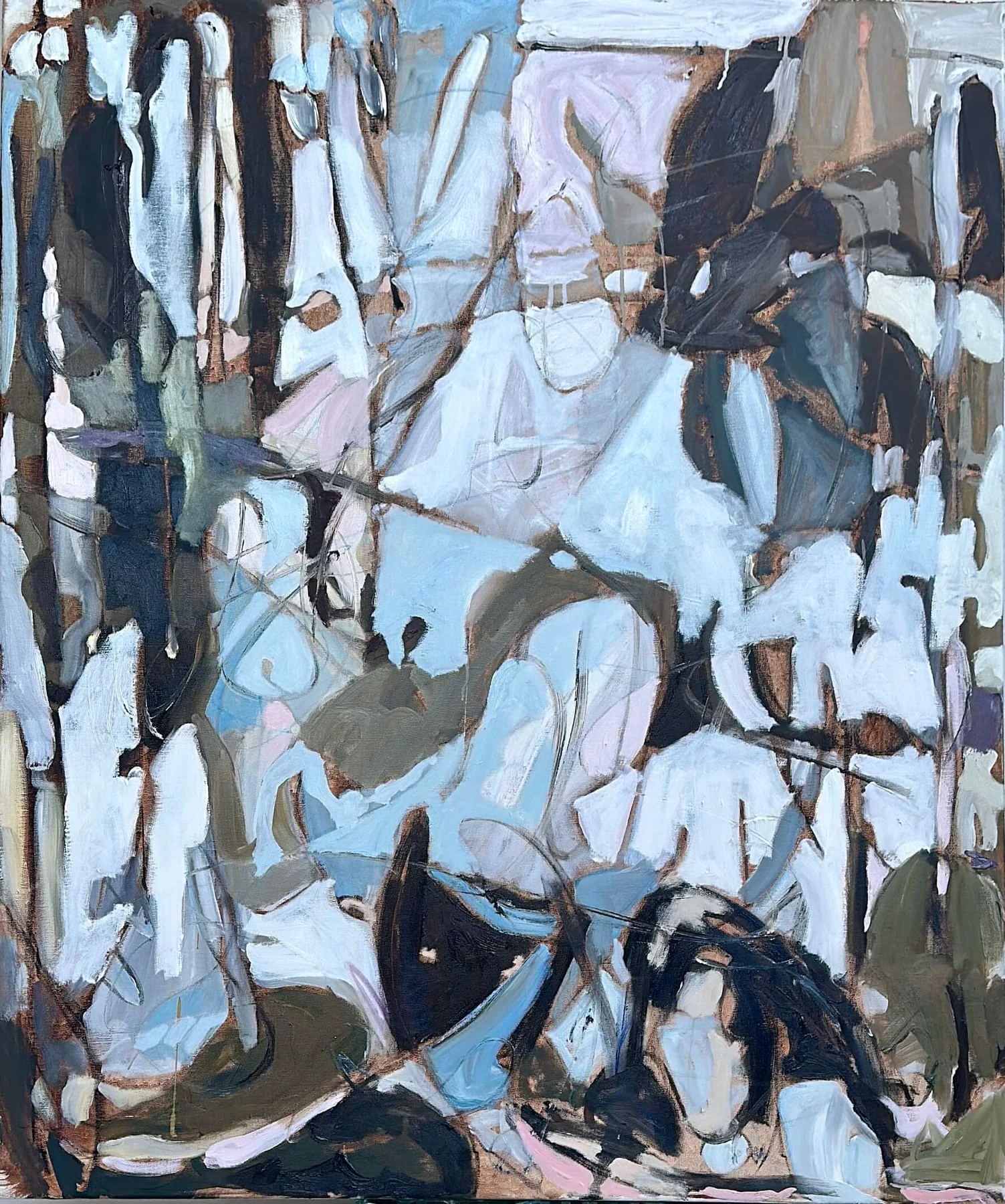
Color in contemporary painting is never merely decoration. It can create pressure, openness, heat, distance, intimacy, and resistance before the viewer has identified a single form. A field of electric pink may advance toward the body while a veil of blue appears to recede. A small interruption of red can reorganize an entire canvas. In this sense, color behaves like architecture: it establishes where attention enters, rests, and moves.
The emotional force of color does not depend on a universal code. Red is not always anger, blue is not always calm, and white is not necessarily empty. Meaning emerges through relationships. A muted green beside a vibrating magenta produces a different psychological register than the same green placed beside bone white. Scale, edge, transparency, and repetition all influence how a color is experienced.
Many painters build color through layers rather than applying a final surface tone. Underpainting rises through translucent passages; fragments of paper interrupt oil; exposed canvas becomes an active interval. These layers give color duration. The eye senses that something existed before the visible moment and that the surface records a sequence of decisions.
To spend time with a color-driven work, notice where the eye travels first and which color seems to control that movement. Then look for the quieter colors that stabilize or complicate the dominant one. The painting may begin to feel less like an arrangement of pigments and more like a living environment with its own gravity, weather, and pulse.