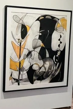
Gray is often described through what it seems to lack: brightness, saturation, or the certainty of a primary color. Yet a gray passage can be warm, cool, luminous, heavy, or almost transparent. Its character becomes apparent through adjacency. Beside one color it recedes; beside another it seems unexpectedly alive.
In drawing, gray also records the distribution of material. A rubbed field differs from a cluster of fine lines even when both appear similar from a distance. One suggests pressure spread across the surface; the other preserves individual actions. Tone and texture work together to establish the pace of looking.
Find the least saturated passage in a work and give it the attention usually reserved for the brightest. What does it allow nearby colors or marks to do? A quiet area may carry the balance of the entire composition. Its restraint can be an active decision rather than a retreat from intensity.